Review of Shine #6
A Diskmag Reading Prophet of Hugi
YES, this is Adok/Hugi typing again. Shine #6 doesn't work on his primary machine either, but it works on his notebook. So he could not only read the mag in a text-editor, like it was the case with Shine #5, but also see the graphics, hear the music and get fascinated by the design at the same time.
Baloo and his friends have really hurried up to release a new issue of Shine within only three months. That's a very short time compared to the twelve months it took to make Shine #3, for instance. And the quality has not suffered from it, either. While I found about 60% of the articles in Shine #3 crap, it's only about 20% in Shine #6. There are two groups of crappy articles. The first is the articles which are shorter than a text-page and are neither informative nor funny - just pure nonsense. They don't even look good. The second group is Psychic Symphony's articles. I don't need to read an article to know the fact that the number of DemoJournal subscribers is faked. I had to distribute DJ for PS while he was on his euro tour and had no regular email address, and I got 15-30 mail delivery failure messages per issue. So I've already known that the real number of subscribers is considerably lower than what's specified in DJ. But then again, this is highly subjective, and you might think differently about it.
On the other hand, Shine issue six also contains some very good articles. For example an extensive report of Dreamhack '99, written by Melwyn. Or the articles by the members of Access Denied, the editors of the soon to be revived Scenial diskmag.
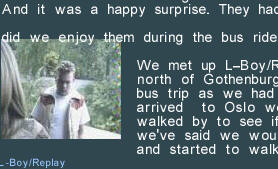
What I really dislike is the appearance of the type. It's good that Shine now supports true-type fonts. But please, if you use non-fixed width fonts, then also implement justified text, like in Hugi. It looks horrible if the text lines have very different widths. Even more horrible is how you formatted the party results. Either implement tables or use a fixed width font for the results, but please never ever do it like in Shine #6 again. Also please care that no photo is overwritten by text, like it's the case on the first page of the Distance '99 report (see shot on the right), for example. And disable anti-aliasing in full-screen mode - you simply can't read the text. And make the spaces between two words smaller. They are out of proportion. And be more careful at formatting articles. There are authors who omit the space between a punctuation mark and a character. This looks really ugly and makes the text harder to read. It's the job of an editor to fix such mistakes.
What I really like is the different background graphics, the title and
and ending pictures, the music, and the illustrations in the articles
(cliparts, photos, and screenshots). They motivate you even to read
articles about fairly boring topics, such as cinema reviews.
To Baloo and the other editors of Shine: Please don't take my criticism hard. The reason I'm more critical than usual is: you are on the way to become a really good diskmag, and I think this is the stage where a mag needs feedback most in order to eradicate the last few shortcomings. I'm looking forward to Shine #7!