How I create those graphics...
The artist currently known as TAD ;)
Welcome to the wacky world of potty pixels and loopy lines,
also known as graphics (or "using every known filter known
to man to disguise badly drawn objects" (tm) heheh ;)).
Over the past few days I have drawn a number of background
screens, logos, mouse-cursors and opening/closing screens.
It all started when Adok posted a snapshot of Hugi 19 which
featured Sappy's background (hi Sappy) with some article text
overlaid in order to check the colours, font and general layout.
Sappy's graphics looked nice enough, although, IMVHO, I thought a
far 'more groovy' background was needed, or at least give the
reader the option of choosing a different one.
Anyway, here is my method of 'graph-ing' (or perhaps "grafting" is
more correct here..). No doubt there will be a million of true
artists out there who will laugh so much that they will fall
off their chairs and roll on the floor while reading this...
I do not consider myself as an artist, but someone who every so
often is known to push RGB pixels around the digital canvas.
Right, that's enough waffle, let's look at each JPEG and then disect
the methods used to create each one. Oh BTW, to create these graphics
I used D-paint enhanced, Picture Publisher v6 and Picture Publisher
v8 (demo version).
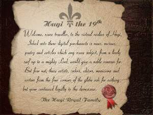 The first task was to create the parchment texture, this was done
using a 'cloud' effect which takes the current foreground colour
and then draws a random, fractal cloud like effect. This was the
basis for the rough texture which was 'bumped' using the nice
Light-studio function in PP8 (Picture Publisher v8) using a
bump-map light source effect. The yellow/tan colour of the paper
was created using the Adjust-Gamma function to mess around with
the Red, Green and Blue values. The rough edges were created
using nothing more than a simple round brush, which was used to
'chew' away at the straight edges of the parchment. After this
some shading was done using a Darken tool using about 5...10%
of pressure to give the edges a more dirty, worn feeling to
them. The same shading tool using a 2..3 pixel wide brush was
used to create the rips from each edge. All the text and
'Royal plume' was added using a semi-transparent, anti-aliased
function so that the black ink looks like it has soaked into
the paper and/or has faded a little. (Solid black text would
look far too dark.) The royal seal is a re-scaled version of
a much larger red, wax seal I drew about a week or so earlier.
Lastly a very old 'green-carve' texture was added and recoloured
(i.e. Gamma-adjusted) to give a dark wood desk feel to the
surrounding background.
The first task was to create the parchment texture, this was done
using a 'cloud' effect which takes the current foreground colour
and then draws a random, fractal cloud like effect. This was the
basis for the rough texture which was 'bumped' using the nice
Light-studio function in PP8 (Picture Publisher v8) using a
bump-map light source effect. The yellow/tan colour of the paper
was created using the Adjust-Gamma function to mess around with
the Red, Green and Blue values. The rough edges were created
using nothing more than a simple round brush, which was used to
'chew' away at the straight edges of the parchment. After this
some shading was done using a Darken tool using about 5...10%
of pressure to give the edges a more dirty, worn feeling to
them. The same shading tool using a 2..3 pixel wide brush was
used to create the rips from each edge. All the text and
'Royal plume' was added using a semi-transparent, anti-aliased
function so that the black ink looks like it has soaked into
the paper and/or has faded a little. (Solid black text would
look far too dark.) The royal seal is a re-scaled version of
a much larger red, wax seal I drew about a week or so earlier.
Lastly a very old 'green-carve' texture was added and recoloured
(i.e. Gamma-adjusted) to give a dark wood desk feel to the
surrounding background.
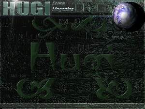 This was the first background I drew for Hugi 19. Again using
my old 'green-carve' texture I filled the entire screen with
it and then adjusted the brightness so that the article text
would stand out and be highly readible. The top logo panel and
bottom URL panel were done using PP8's nice bevel-factory.
This accepts a mask and allows a 'plinth' like effect to be
easily created. The angle, colour and brightness of a light
source can be defined, along with a texture and bevel shape.
For this picture I used an edge size of about 6 pixels to
make it more visible from the main window below it. Still
keeping the panel masks I highlited the edges and shaded
some other parts to make it look far less flat. The planet
was added using a collection of cloud, lighting, gamma
correction and the sphere effect. The globe was shaded by
hand and a small highlite was added. The "HUGI" logo was
drawn using a heavy Arial font, bump mapped using steel
and then (you've guessed it) gamma-corrected to green.
A few flicks with the highlite brush turned the letters into
green jello/jelly. A small lense-flare was added to make
the HUGI logo stand out a bit more. Finally the large green
"Hugi" and ornate symbols were created from 2 different
fonts, embossed to give a bright edge and then a high motion-blur
amount was used to give a 3-d feeling to the letters.
This was the first background I drew for Hugi 19. Again using
my old 'green-carve' texture I filled the entire screen with
it and then adjusted the brightness so that the article text
would stand out and be highly readible. The top logo panel and
bottom URL panel were done using PP8's nice bevel-factory.
This accepts a mask and allows a 'plinth' like effect to be
easily created. The angle, colour and brightness of a light
source can be defined, along with a texture and bevel shape.
For this picture I used an edge size of about 6 pixels to
make it more visible from the main window below it. Still
keeping the panel masks I highlited the edges and shaded
some other parts to make it look far less flat. The planet
was added using a collection of cloud, lighting, gamma
correction and the sphere effect. The globe was shaded by
hand and a small highlite was added. The "HUGI" logo was
drawn using a heavy Arial font, bump mapped using steel
and then (you've guessed it) gamma-corrected to green.
A few flicks with the highlite brush turned the letters into
green jello/jelly. A small lense-flare was added to make
the HUGI logo stand out a bit more. Finally the large green
"Hugi" and ornate symbols were created from 2 different
fonts, embossed to give a bright edge and then a high motion-blur
amount was used to give a 3-d feeling to the letters.
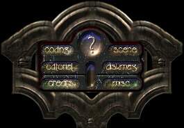 This is probably my favourite image because it took the
longest to draw and has, IMHO, a heavy gothic/high-tec
feel to it. The starting point was the gothic archs which
were created using PP8's bevel-factory, light-studio and
a few home-made textures. The arch mask was made using a
number of overlapping ellipses to form a 'bite-mark' edge.
This mask was shaped by a 'm' shaped bevel and coloured
using a lots of different light sources until a stone/brass
colour was found. I used the crusty old D-paint to draw
some monochrome shapes including a rounded-off frame and
the 8 buttons as used in the main centre panel. This PCX
file was saved and loaded into PP6 in order to create the
button masks and to fill the panel with a rough Aztec-like
texture. The buttons were shaded, highlited and coloured to
give a more interesting feel to them using green, blue and
a little yellow/pink. The text for each button was then
added using a little texture, transparency and shading.
The rather groovy '?' icon was done using some overlapping
text. A 2nd copy of the '?' character was used to shade
the 1st and this gave a simple, but effective metallic look
to it. A drop-shadow was added to the text to make it stand
out a little and look more 3-d ish. Finally the archs were
copied, flipped and rescaled down to create the gothic border
around the almost rectangular button panel. After lots of
shading and smoothing by hand the entire picture was saved
and posted to Adok.
This is probably my favourite image because it took the
longest to draw and has, IMHO, a heavy gothic/high-tec
feel to it. The starting point was the gothic archs which
were created using PP8's bevel-factory, light-studio and
a few home-made textures. The arch mask was made using a
number of overlapping ellipses to form a 'bite-mark' edge.
This mask was shaped by a 'm' shaped bevel and coloured
using a lots of different light sources until a stone/brass
colour was found. I used the crusty old D-paint to draw
some monochrome shapes including a rounded-off frame and
the 8 buttons as used in the main centre panel. This PCX
file was saved and loaded into PP6 in order to create the
button masks and to fill the panel with a rough Aztec-like
texture. The buttons were shaded, highlited and coloured to
give a more interesting feel to them using green, blue and
a little yellow/pink. The text for each button was then
added using a little texture, transparency and shading.
The rather groovy '?' icon was done using some overlapping
text. A 2nd copy of the '?' character was used to shade
the 1st and this gave a simple, but effective metallic look
to it. A drop-shadow was added to the text to make it stand
out a little and look more 3-d ish. Finally the archs were
copied, flipped and rescaled down to create the gothic border
around the almost rectangular button panel. After lots of
shading and smoothing by hand the entire picture was saved
and posted to Adok.
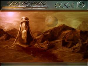 Now, first of all I must explain that the original picture
was much, much brighter (and IMHO better looking). It had a
nice 'Total Recall: Mars' feeling to it, but sadly Adok
insisted that the contrast had to be turned down in order
to make the article text readible.. (tsh, diskmag editors eh? ;))
Anyway the sky was the first thing to be created using a vast
amount of steps which I have completely forgotten (doh!). It
involved using disturb, cloud, smoothing, motion-blur, lighting
and 'drag-morphing', which is kinda like a smear effect. This was
used to churn up the clouds and give a more chaotic look.
The mountains were re-gamma-ed parts of the sky, shaded, morphed
and cloned to give peaks, valleys and slopes. The ground was
drawn using scaled down, semi-transparent version of the mountains
and then a little motion-blur was added to pull the rocks/dirt
to the left and right. Parts of the mountains were masked and
made 60...80% transparent and merged into the distance to look
like they are miles away, lost in the Mars-like atmosphere.
A lense-flare was added for the sun and then smoothed slighty
to give the impression of thick heavy cloud. My favourite part
was then added, the nice Hugi effigy. Believe it or not, but
that is actually my face!! Yep, being a fool I scanned my ugly
mud using a flat-bed scanner (ouch! I can't see... this light is
too bright.. etc..). After lots drag-morphing and a 'pinch' effect
the head took on a more 'Easter-island' style. It was added and
merged into the background using smooth, transparent-cloning and
a few highlites and lots of shadows. The top 'HUGI19' panel was
created by using far too much smooth on the background (so it
lost almost all detail), then the highly useful motion-blur was
used to pull the letters up and to the right. This created a
shiny, metal look, which I think looks rather nice combined with
the 'scene magazine' text. The text was created using 2 copies,
the first was lit using PP8 light-studio and then smoothed, the
second was turned completely black and overlaid to give a
jet black/gold surround to each letter. Oh, you might just be
able to make out a small dude in front of the Hugi statue.
(And no!, I did not scan my entire body..) His name is NuB3,
heheh.
Now, first of all I must explain that the original picture
was much, much brighter (and IMHO better looking). It had a
nice 'Total Recall: Mars' feeling to it, but sadly Adok
insisted that the contrast had to be turned down in order
to make the article text readible.. (tsh, diskmag editors eh? ;))
Anyway the sky was the first thing to be created using a vast
amount of steps which I have completely forgotten (doh!). It
involved using disturb, cloud, smoothing, motion-blur, lighting
and 'drag-morphing', which is kinda like a smear effect. This was
used to churn up the clouds and give a more chaotic look.
The mountains were re-gamma-ed parts of the sky, shaded, morphed
and cloned to give peaks, valleys and slopes. The ground was
drawn using scaled down, semi-transparent version of the mountains
and then a little motion-blur was added to pull the rocks/dirt
to the left and right. Parts of the mountains were masked and
made 60...80% transparent and merged into the distance to look
like they are miles away, lost in the Mars-like atmosphere.
A lense-flare was added for the sun and then smoothed slighty
to give the impression of thick heavy cloud. My favourite part
was then added, the nice Hugi effigy. Believe it or not, but
that is actually my face!! Yep, being a fool I scanned my ugly
mud using a flat-bed scanner (ouch! I can't see... this light is
too bright.. etc..). After lots drag-morphing and a 'pinch' effect
the head took on a more 'Easter-island' style. It was added and
merged into the background using smooth, transparent-cloning and
a few highlites and lots of shadows. The top 'HUGI19' panel was
created by using far too much smooth on the background (so it
lost almost all detail), then the highly useful motion-blur was
used to pull the letters up and to the right. This created a
shiny, metal look, which I think looks rather nice combined with
the 'scene magazine' text. The text was created using 2 copies,
the first was lit using PP8 light-studio and then smoothed, the
second was turned completely black and overlaid to give a
jet black/gold surround to each letter. Oh, you might just be
able to make out a small dude in front of the Hugi statue.
(And no!, I did not scan my entire body..) His name is NuB3,
heheh.
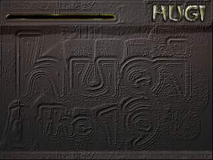 Personally I think this is the weakest graphics I drew, but it
does make any text highly readible (which is kinda useful for a
diskmag I guess.. heheh). Not much to say about this, the nice
PP8 bevel-factory was used to create a monster edge around the
middle 'Hugi the 19th' text. Then the Hugi effigy face was
rescaled and used to fill the bottom left corner. The entire
screen was then recoloured and lit using the 'dusk' and 'dawn'
lighting schemes. And finally a badly drawn shadow was added
under the top panel to give a bas-relief look. BTW, it's
supposed to be a kinda tomb/pyramid picture with the viewer
looking closely at an ancient block of stone...
Personally I think this is the weakest graphics I drew, but it
does make any text highly readible (which is kinda useful for a
diskmag I guess.. heheh). Not much to say about this, the nice
PP8 bevel-factory was used to create a monster edge around the
middle 'Hugi the 19th' text. Then the Hugi effigy face was
rescaled and used to fill the bottom left corner. The entire
screen was then recoloured and lit using the 'dusk' and 'dawn'
lighting schemes. And finally a badly drawn shadow was added
under the top panel to give a bas-relief look. BTW, it's
supposed to be a kinda tomb/pyramid picture with the viewer
looking closely at an ancient block of stone...
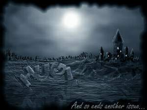 Ah, this is another case of Adok ruining my beautiful artwork..
(only joking, Adok had some problems using JPEG to compress
the picture down to a good size, so I had to replaced some
small text, recolour and add a fancy border to make the JPEG
smaller). It all started with the 3d-HUGI-bridge font. This
was created by taking each of the 4 letters and drawing them at
different angles. The flat 'demolished' word was then twisted
using a perspective and distort so that it appears to get
smaller towards the end 'I' letter. The 3-d effect was all done
by hand using a small brush and the clone-function. Each edge
on the top and left side of the 3-d logo was drawn and either
shaded or highlited. The logo was then badly scaled up on purpose
to give a rough rock effect (where the edges have been worn away
and chipped over time). The sky is a reasonable example of using
motion-blur and drag-morph to create clouds (although the part
of the right is a little too regular for my liking). The castle
was drawn using the mask function, good-old gamma-correction
and a little texture fill. The small grain texture helped to
give a more stone-block look after adding the highlites from
the moon light. The rocks were created in the same way as the
Mars-Hugi-effigy mountains were created. The nice window lights
were created using a round 2...4 pixel highlite brush and a
few vertical strokes to form a rounded off 'i' shape. The
finishing touch was the bottom window sills formed by cloning
part of the roof over the bottom of the window light. This
created an easy arch (check out the top-most window).
The water/swampy ground was created using the handy
motion-blur and a few rescales/smooth operations. A reflection
was added by flipping the "HUGI" bridge upside down and then
rotating it by about 5...10 degrees in order to match the
perspective. The reflection was made 80%..90% transparent and
filtered to only show the lighter pixels.. The entire screen
was converted to black & white, then back to colour and
gamma-corrected (again) to a nice moonlight blue/grey.
Ah, this is another case of Adok ruining my beautiful artwork..
(only joking, Adok had some problems using JPEG to compress
the picture down to a good size, so I had to replaced some
small text, recolour and add a fancy border to make the JPEG
smaller). It all started with the 3d-HUGI-bridge font. This
was created by taking each of the 4 letters and drawing them at
different angles. The flat 'demolished' word was then twisted
using a perspective and distort so that it appears to get
smaller towards the end 'I' letter. The 3-d effect was all done
by hand using a small brush and the clone-function. Each edge
on the top and left side of the 3-d logo was drawn and either
shaded or highlited. The logo was then badly scaled up on purpose
to give a rough rock effect (where the edges have been worn away
and chipped over time). The sky is a reasonable example of using
motion-blur and drag-morph to create clouds (although the part
of the right is a little too regular for my liking). The castle
was drawn using the mask function, good-old gamma-correction
and a little texture fill. The small grain texture helped to
give a more stone-block look after adding the highlites from
the moon light. The rocks were created in the same way as the
Mars-Hugi-effigy mountains were created. The nice window lights
were created using a round 2...4 pixel highlite brush and a
few vertical strokes to form a rounded off 'i' shape. The
finishing touch was the bottom window sills formed by cloning
part of the roof over the bottom of the window light. This
created an easy arch (check out the top-most window).
The water/swampy ground was created using the handy
motion-blur and a few rescales/smooth operations. A reflection
was added by flipping the "HUGI" bridge upside down and then
rotating it by about 5...10 degrees in order to match the
perspective. The reflection was made 80%..90% transparent and
filtered to only show the lighter pixels.. The entire screen
was converted to black & white, then back to colour and
gamma-corrected (again) to a nice moonlight blue/grey.
Ah well, that's all folks.. I hope you enjoy the graphics..
and remember.. don't place your face in a flatbad scanner.. ;)
TAD/Hugi